My passport expired last month shortly after I finished rewatching this talk by Nicholas Felton at Eyeo2012. If you're not familiar with the Feltron Annual Report, this 99% Invisible episode is a great introduction to it. There is a part of the talk where he describes using his father's passport to recreate location history and I thought, "I could do that for my passport."
After going through a few pages and recording the entry and exit stamps in a text file, I thought about this article by Teller where he reveals that
You will be fooled by a trick if it involves more time, money and practice than you (or any other sane onlooker) would be willing to invest.
If you watch the Felton talk, you realize that's really what makes the Feltron Annual Reports so special - Felton puts more time and energy into collecting, parsing, and collating the data than he actually does choosing and designing the visualizations.
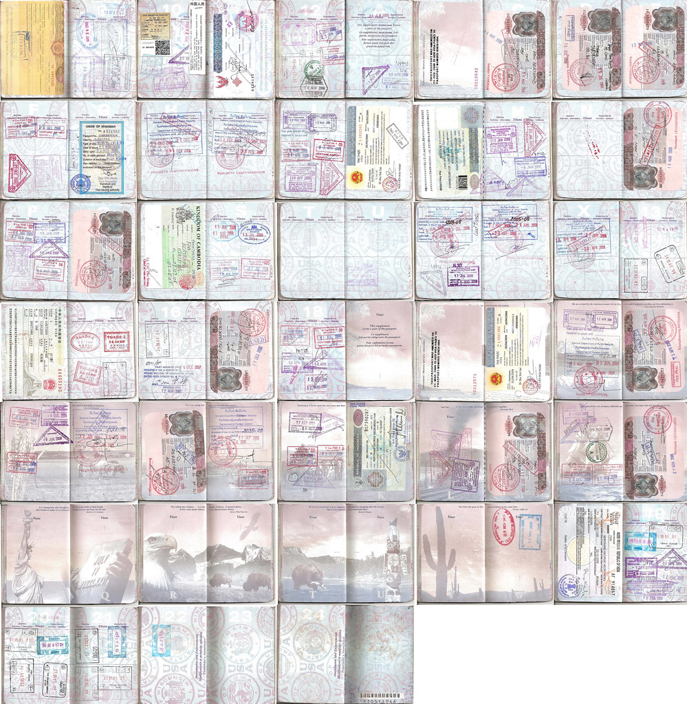
Transcribing a passport is a tedious job. It took me well over two hours to decipher and translate locations and dates from smudged stamps, basically turning this:
into this:
Piping that file through unix sort and deleting the extraneous lines gave me this:
And then I looked up the country codes for each country and edited it until I got this JSON file:
Now that I had my location history in a machine-readable format, I needed a way of visualizing the changes in location over time.
Fortunately, I had been working on something similar at Jetpac for our on-boarding experience. We had found some vector dot maps of the world and we thought it would be cool to light up portions of them based on the countries that you've been to and wanted to go.

Unfortunately, the vector dot maps that we found weren't divided into countries, but we did find some normal SVG maps of the world that were. At that point we decided we would just roll our own dot map and Chris came up with a brilliant rasterization strategy:
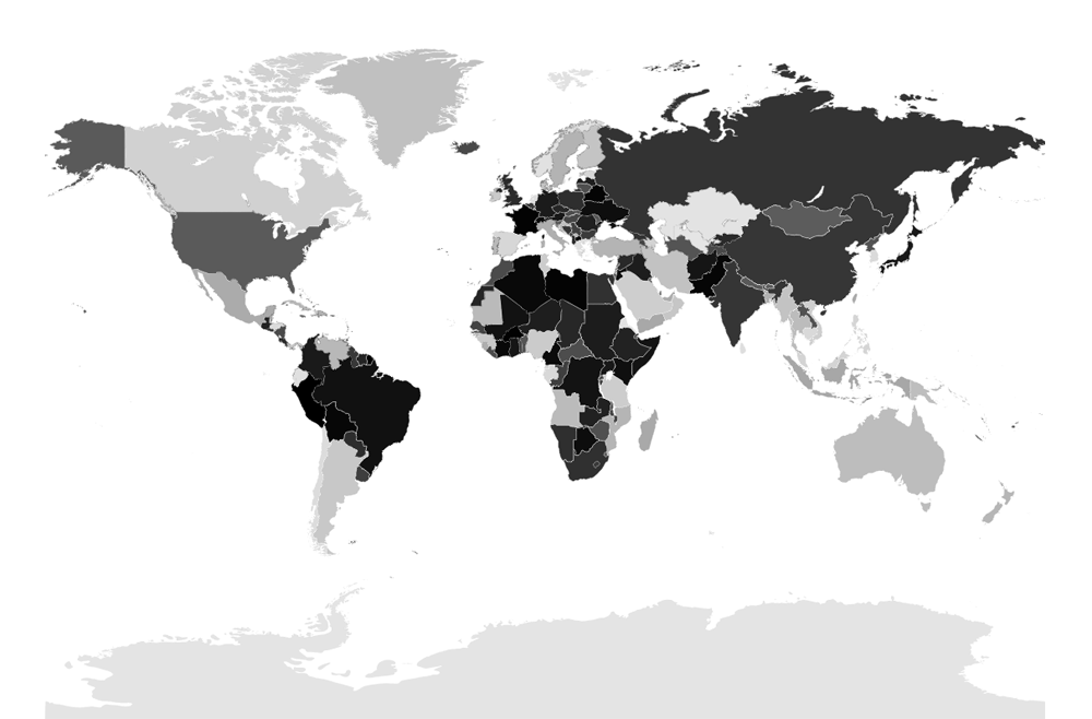
First, we started with a normal SVG map.
.svg)
Since SVG is just XML, I wrote a python script to go through and assign a different shade of grey to every country in the map by modifying the style.
which gave us this:
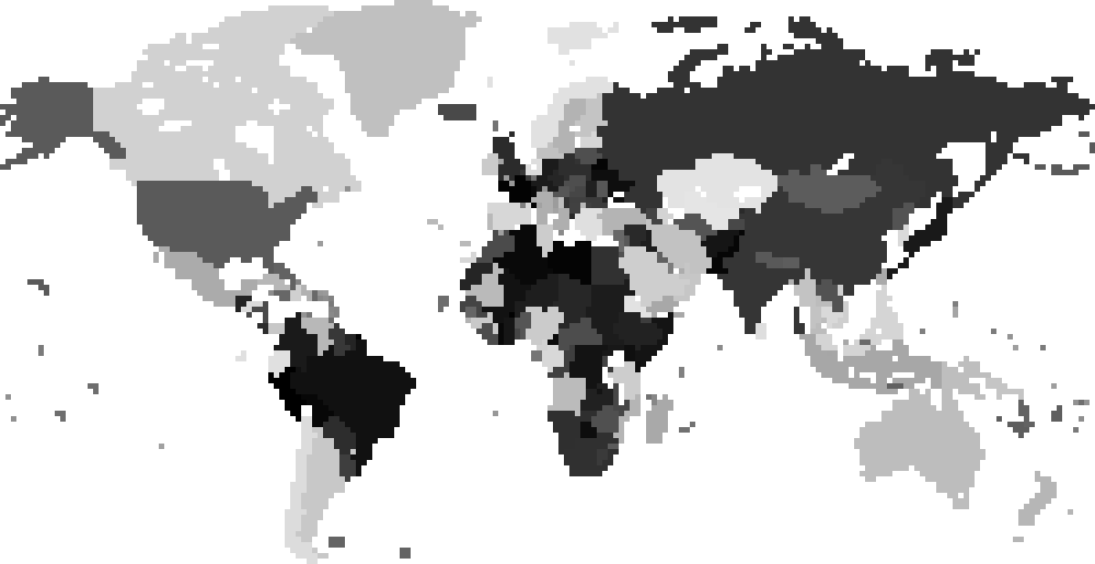
Then we removed Antarctica and resized that image to a small thumbnail (200x103) using Nearest Neighbor resampling so that the colors would not blend:

If you zoom in on it a bit, you can see it in all of its pixelated glory:
This final image serves as the guide for drawing our map. We simply loop through every pixel in the image and if the pixel is non-white, we draw a circle on a canvas at the translated position which is calculating by just multiplying the coordinates by a mulitiplier like 5. For example, the pixel at (7,14) which belongs to Alaska may translate to (35,70) and we can draw a circle with its center at that position. If we wish to color in a country a different color, we determine the country code through a lookup table:
The number that we receive from the lookup corresponds to the shade of gray of each country in the image. By reading the red, green, or blue value of the pixel and comparing it to the number, we can determine whether or not we should color in the circle a different color or not.
Once I had a way of drawing a dot map of the world, creating the visualization was pretty straightforward. I divided the ten years into days, specifically 3654 days (don't forget the leap years). Then I wrote a node.js script to parse the trips JSON I hand-crafted earlier - it creates a lookup table that given a particular day tells me which countries I had been to since the passport epoch (December 17, 2002) and which country I was in on that particular day:
When the slider moves, I calculate the day it's on and use the lookup table to determine which countries to draw as visited and which country to draw as the current country and use the algorithm I described to refresh the map.
That's pretty much it! I hope you enjoyed the visualization and the explanation of how it was created.